Case Study

The Zen

The Zen operates multiple restaurant locations serving Hakka Chinese, Thai and Guyanese cuisine across Whitby, Stouffville, Toronto and Scarborough. We built one website that keeps each location’s menus, lunch specials and contact details separate while maintaining a consistent brand experience.
IndustryRestaurants & Hospitality
ServicesWeb Design & Development
PlatformWordPress, PHP, MySQL +5 more
The Zen

The Challenge

Four Locations. One Brand. No Room for Confusion.

THE ZEN was starting online from scratch with a multi-location challenge. Whitby, Stouffville, Downtown Toronto and Scarborough needed to feel connected, yet every restaurant has its own contact details, menus, lunch offers and ordering routes. Diners had to reach the correct local information quickly without mistaking one location’s details for another’s.

  • Location-specific informationMenus, prices, specials and contact details vary by restaurant.
  • One connected brand experienceFour locations needed to feel related without blending their local details.
  • Several menu journeysDine-in, takeout and lunch-special content must remain easy to distinguish.
  • The right action for each dinerCalls, online orders and directions must route to the selected location.
  • A new digital structureThe project began from scratch, without an existing website to reorganize.

Project Overview

A Multi-Location Restaurant Website Built From Scratch

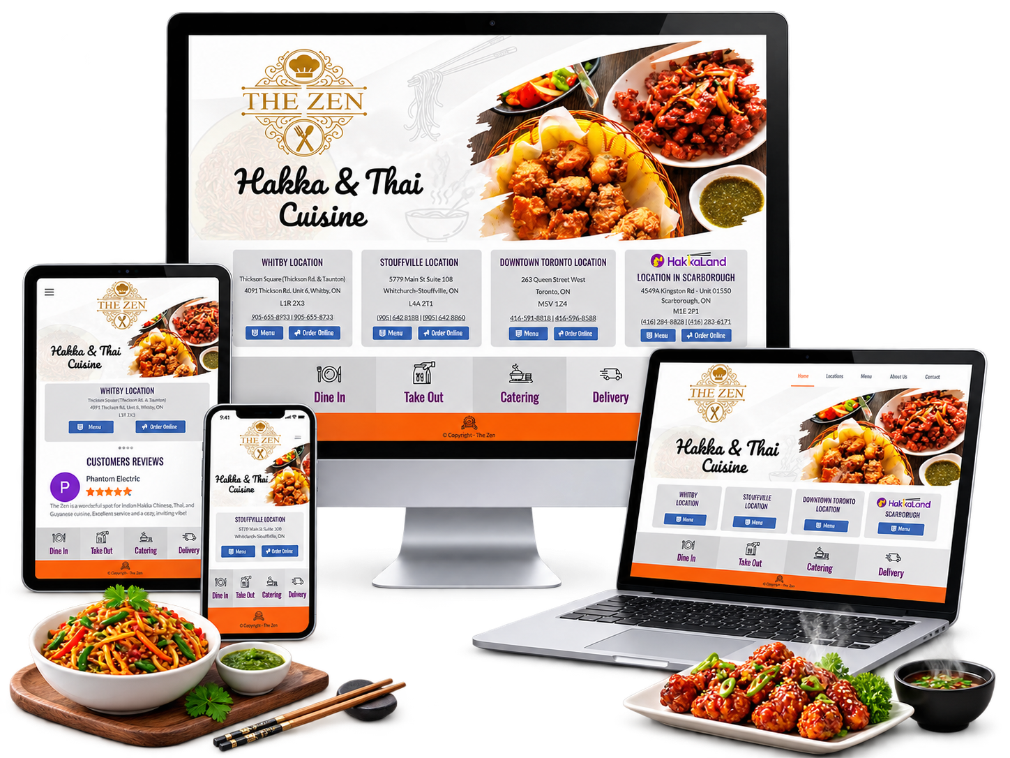
Saiftec designed and developed a WordPress website around the way diners make decisions: choose a location, review the relevant menu, then call, order or get directions. Dedicated Stouffville and Downtown Toronto content lives within THE ZEN website, while Whitby and Scarborough connect clearly to their related restaurant sites. The result is one recognizable digital front door without flattening every location into the same experience.

New website built from scratch
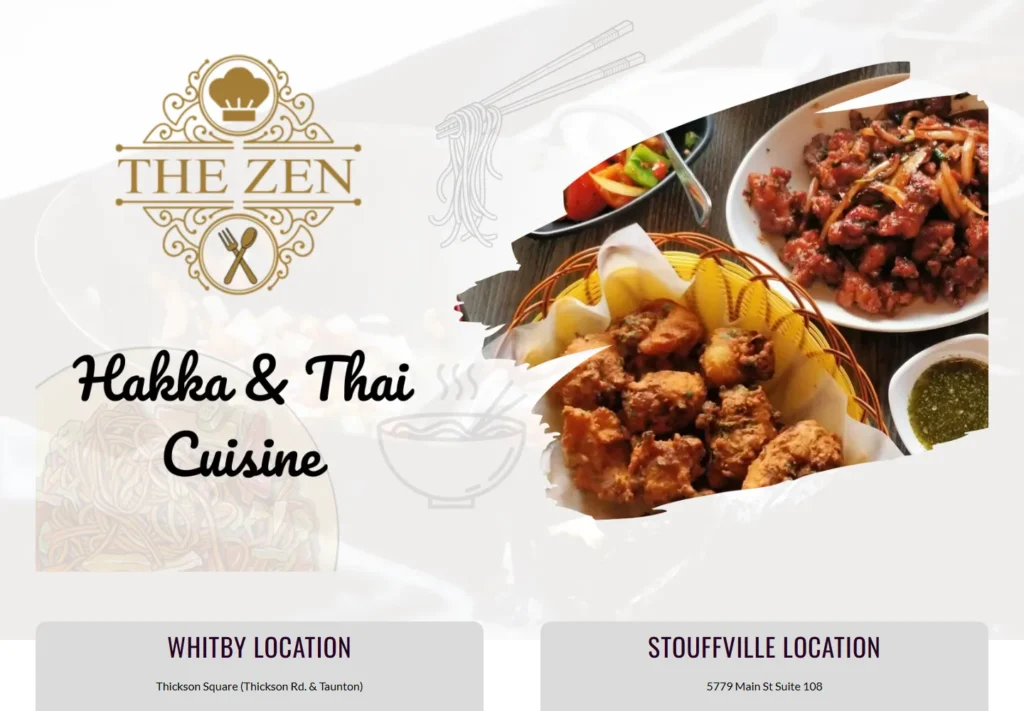
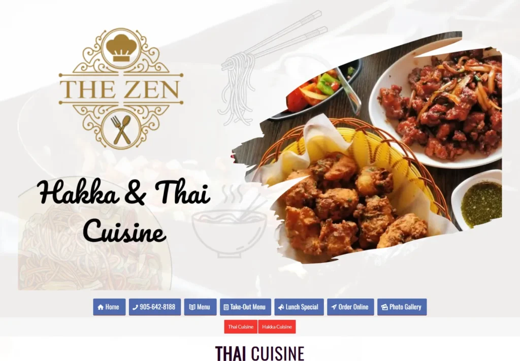
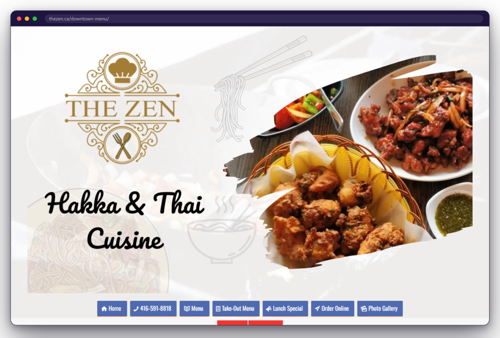
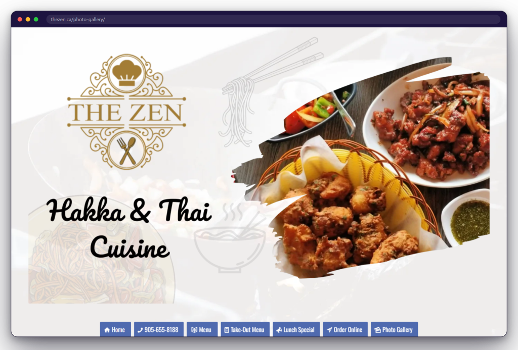
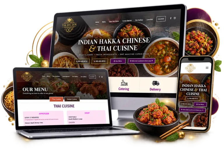
The Zen website displayed on desktop
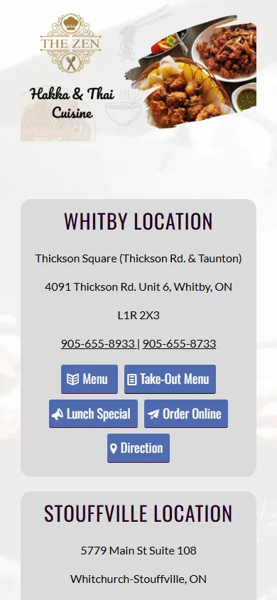
The Zen website displayed on mobile
  • Four location entry pointsWhitby, Stouffville, Downtown Toronto and Scarborough.
  • Three menu pathsDine-in, takeout and lunch specials stay clearly separated.
  • Direct customer actionsCall, order online or open directions from the chosen location.
  • Responsive accessThe same location-led journey works across desktop and mobile.

Our Solution

Every Location Became a Clear Customer Journey

We organized THE ZEN around location-specific pathways instead of a single overloaded restaurant page. Each pathway brings the diner’s essentials together—address, phone, menu type, ordering link and directions—while responsive layouts, searchable menu content and shared branding keep the experience consistent.

View the Live Website
  • Location-led information architectureEvery restaurant has a distinct path within the wider brand experience.
  • Searchable HTML menusDish names and descriptions are page content, not flattened menu images.
  • Action-first location panelsMenus, calls, online ordering and directions sit beside local details.
  • Responsive restaurant journeyLocation selection and menu access adapt for phones and larger screens.
  • Visible social proofCustomer reviews reinforce trust without interrupting the ordering path.
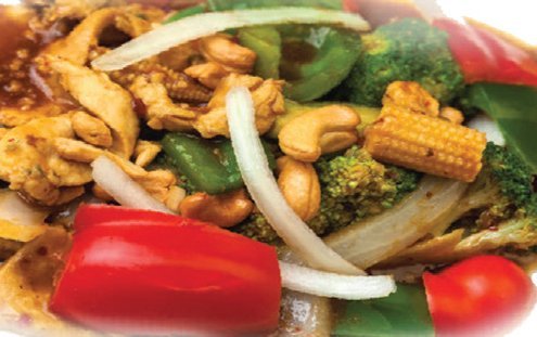
Thai cashew nut chicken served by THE ZEN
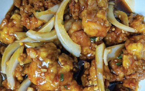
Chilli chicken served by THE ZEN
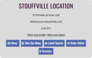
Stouffville location card with menu, takeout, lunch special, online ordering and directions actions
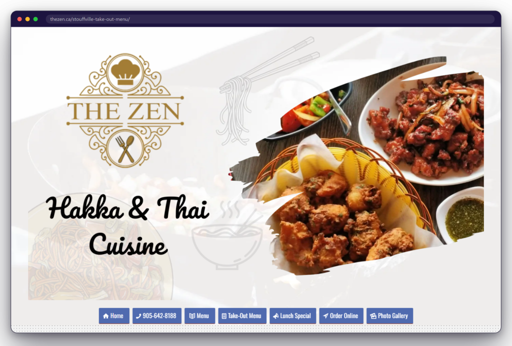
Location-specific action path

Outcomes

A Clearer Way to Discover, Choose and Order

  • The right details for the right locationEach restaurant presents its own address, phone numbers, menus and next actions together.
  • Menus people can searchDish content is readable in the page and accessible to site search and search-engine crawlers.
  • A shorter path from choice to actionDiners can move directly from a location to its menu, takeaway options, online ordering or directions.
  • A structure ready to evolveLocation-specific pages can be maintained and expanded without turning the group site into one generic menu.
The Challenge
A group of restaurants under one name has a problem a single room does not. Menus differ between locations, so do prices, and lunch specials change independently of each other. A diner searching for one suburb should never be reading another suburb’s prices, and each kitchen needs to change its own sheet without touching anybody else’s.
  • Menus and prices differ between the rooms
  • Lunch specials change room by room
  • Nobody should read another suburb's prices
  • Each kitchen edits only its own sheet
  • The fourth room trades under another name
  • The group still has to read as one brand
  • Every room takes its orders by telephone
Project Preview

A Look at the Finished Work

Our Solution
Each room owns its pages: a dine-in menu, a takeaway sheet, and a lunch special with the terms that apply to it. The brand stays shared, so the site still reads as one group of restaurants, and the fourth room, which trades under a name of its own, is linked from the top rather than swallowed. Every menu is set as text, so a dish can be searched for.
  • A dine-in menu for each room
  • A takeaway sheet for each room
  • A lunch special page with its own terms
  • One shared brand across the four rooms
  • The fourth room linked, not swallowed
  • Menus set as text, so a dish is searchable
  • Photo galleries kept per room
  • Reviews collected and shown on the site
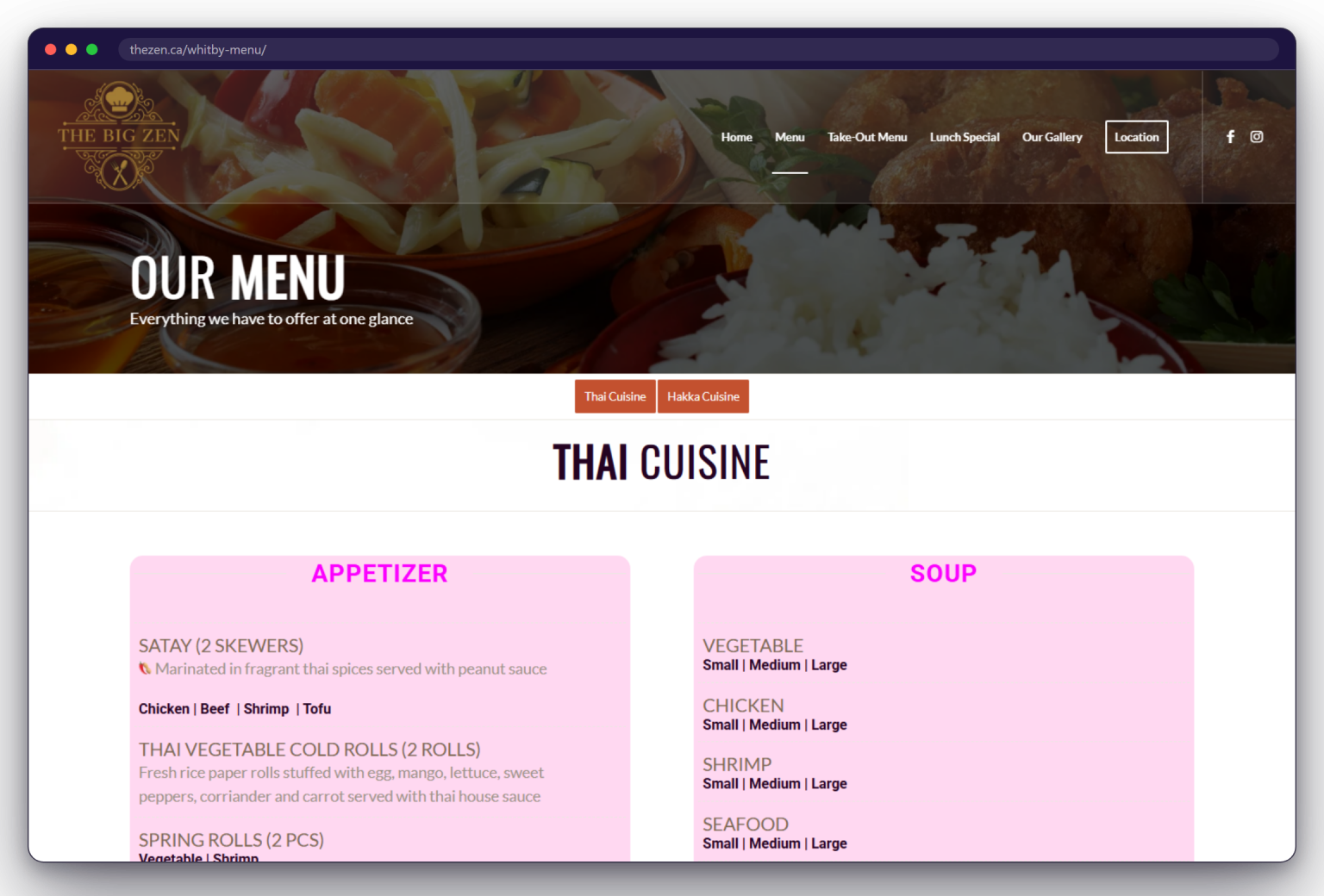
A page from the The Zen website: thezen.ca/whitby-menu/
  • A page per room

    Menu, takeaway and lunch

  • Menus as text

    Searchable, not a picture

  • Four rooms

    Three here, one linked out

  • Number per room

    The right one, on its page

Outcomes

What Changed After Launch

  • Each suburb has its own page

    A search for one location arrives at that location's menu and prices, instead of a group page that lists all four rooms.

  • Dishes can be searched for

    The menus are set as text rather than as a picture of a menu, which is the difference between being found and being unreadable.

  • One brand, four kitchens

    The rooms share a name and a look while keeping their own prices, so the group reads as one business without flattening it.

  • Each room updates itself

    A lunch special or a price is changed for one location alone, leaving the other three exactly as they were.

Client Feedback

What The Zen Says

Saiftec built The Big Zen’s first website around the restaurant’s menu and customer essentials, combining cuisine-led browsing, a downloadable takeout menu, food photography, and a direct route to its Whitby location and phone numbers.
Saiftec built DDM Bin Rentals’ first website as a custom WordPress and WooCommerce rental platform, guiding customers from bin or container selection through delivery details and a Stripe-supported review-and-payment journey.
Gentec Power
A generator service site built around the questions an owner asks before booking an installation.
Technology Stack

Built With a Modern Stack

The platform, languages and tools the finished site runs on.
FAQ

Frequently Asked Questions

How can one website keep each restaurant location’s information separate?

Use a dedicated page group or location card for every restaurant. Each location keeps its own address, phone numbers, menus, specials, ordering links and directions together, while shared branding and navigation connect the experience. That is the structure used for THE ZEN.

Can each location’s menu and lunch specials be updated separately?

Yes. In WordPress, location-specific menu and special pages can be maintained without rewriting a group-wide menu or changing another restaurant’s information. The exact editing workflow and permissions can be tailored to the client’s operating process.

Can diners find individual dishes through search engines?

Menu content built as HTML text can be read, searched and crawled more easily than an image-only menu. That gives individual dishes useful page context, although search visibility still depends on competition, technical health, local relevance and ongoing SEO work.

Can every location connect to calls, delivery and directions?

Yes. Each location can have its own tap-to-call numbers, menu links, online ordering provider and map destination. THE ZEN’s location panels route diners from the restaurant they selected to the matching action instead of relying on one generic contact path.

Will a multi-location restaurant website work well on mobile?

It should. A responsive restaurant site prioritizes location details, readable menus and large call, order and directions targets on smaller screens. THE ZEN’s layout adapts the same location-led journey for phone and desktop visitors.

Can more locations or related restaurant brands be added later?

Yes. A modular location structure allows another restaurant to be added with its own details, menus and actions while retaining shared navigation and visual consistency. Related brands can also be linked clearly without presenting their local content as if it belonged to another location.

Your Project Next

Want Results Like These?

Every project on this page started with one conversation about a problem. Tell us yours and we will show you what is possible.
  • Free

    Consultation

  • Clear Scope

    & Pricing

  • No Obligation

    Assesment

  • Practical

    Recommendation

Prefer to Talk Directly?

Book a free 15 to 30 minute consultation with our team.
WhatsApp
Have a quick question? Message us directly.
+1 (647) 495-9114

Mon-Fri: 9AM – 7PM
Sat: 9AM – 3PM EST

Let’s Talk About Your Requirements

Share your goals, challenges or ideas and we’ll help you identify the right approach, scope and next step.
  • Solutions Tailored to Your Business
  • Clear Recommendations & Next Steps
  • Experienced Web, Software & AI Team
  • Confidential & No Obligation