
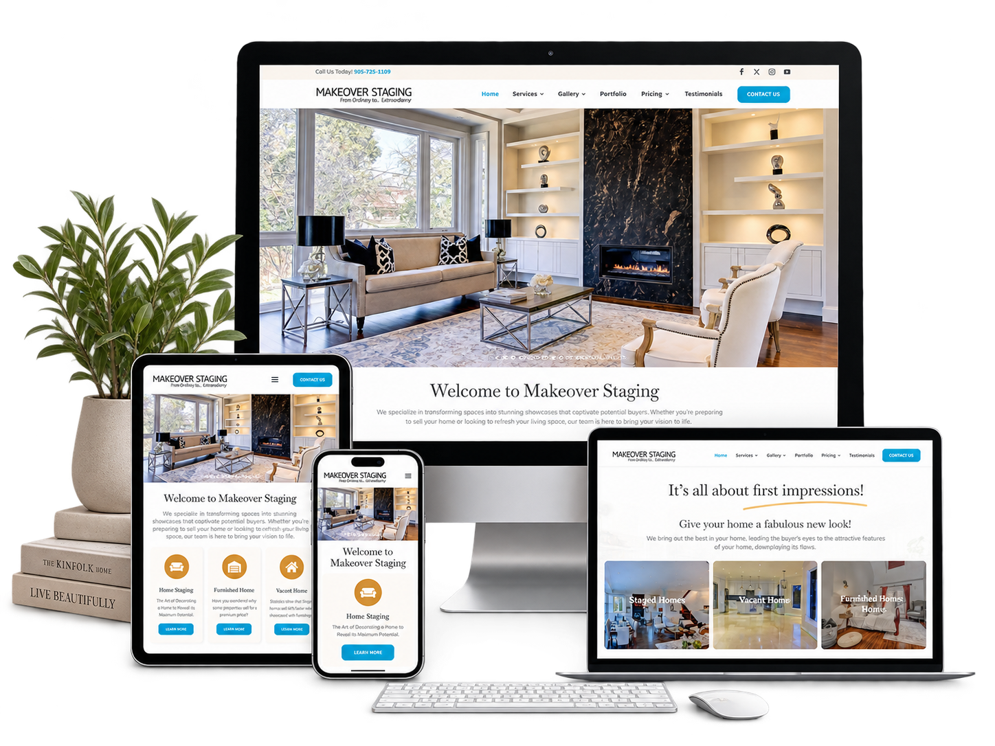


 Existing website rebuilt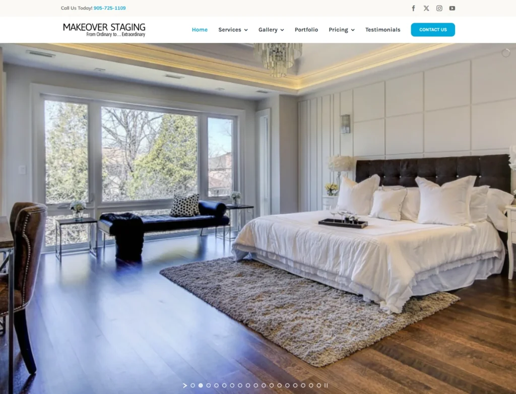




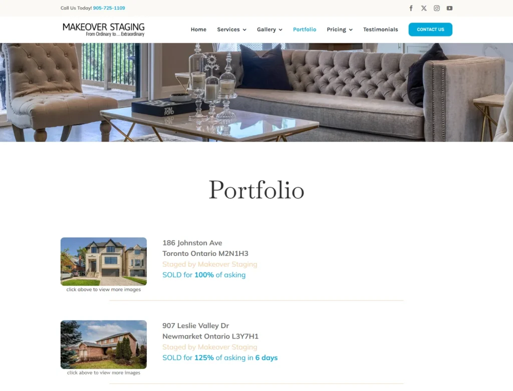
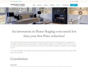
 Published pricing guidance
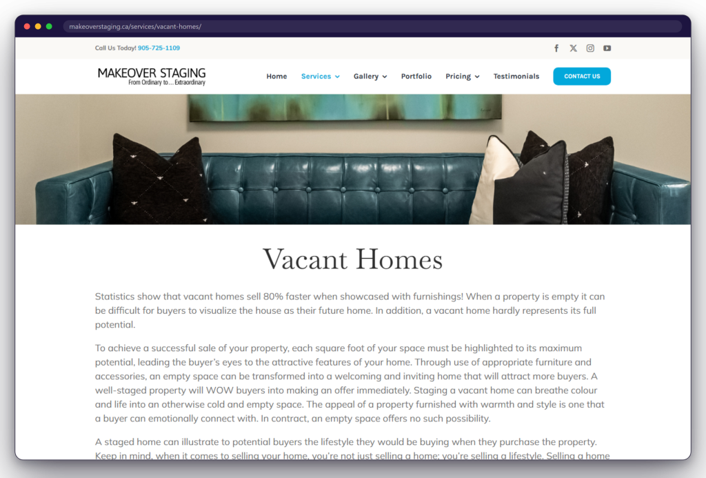
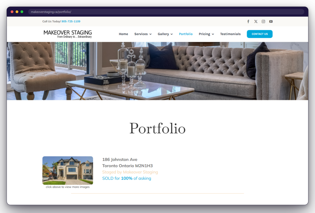
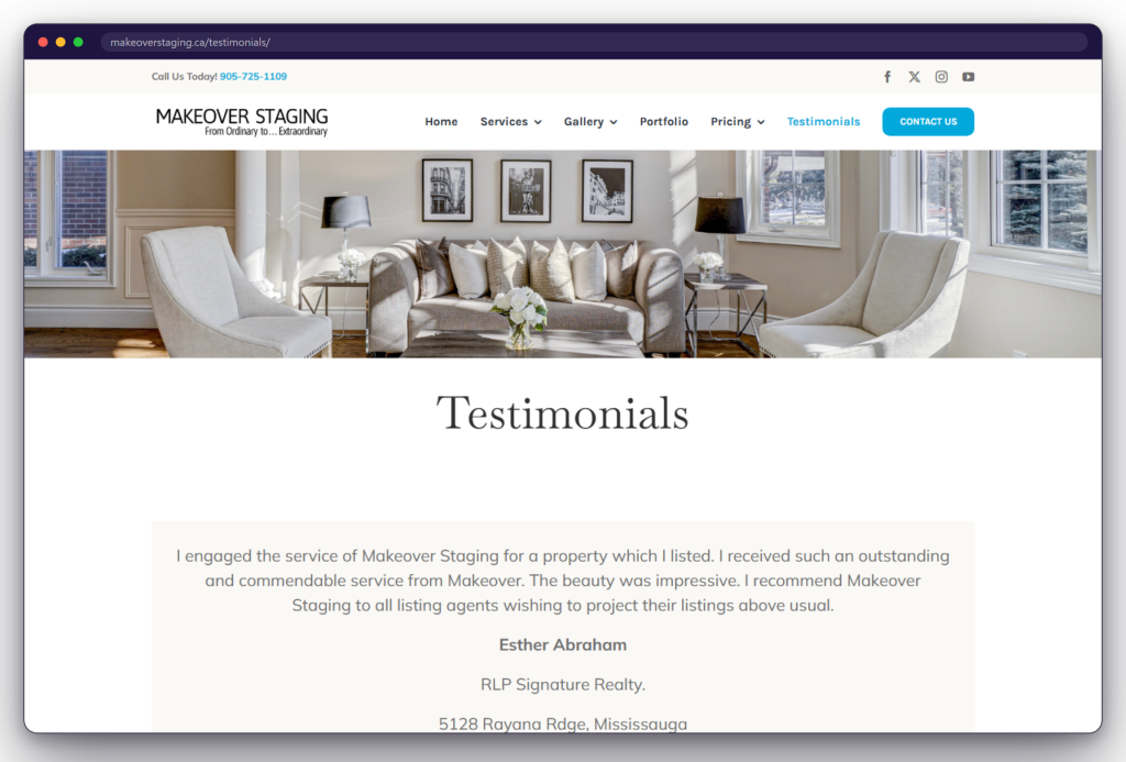
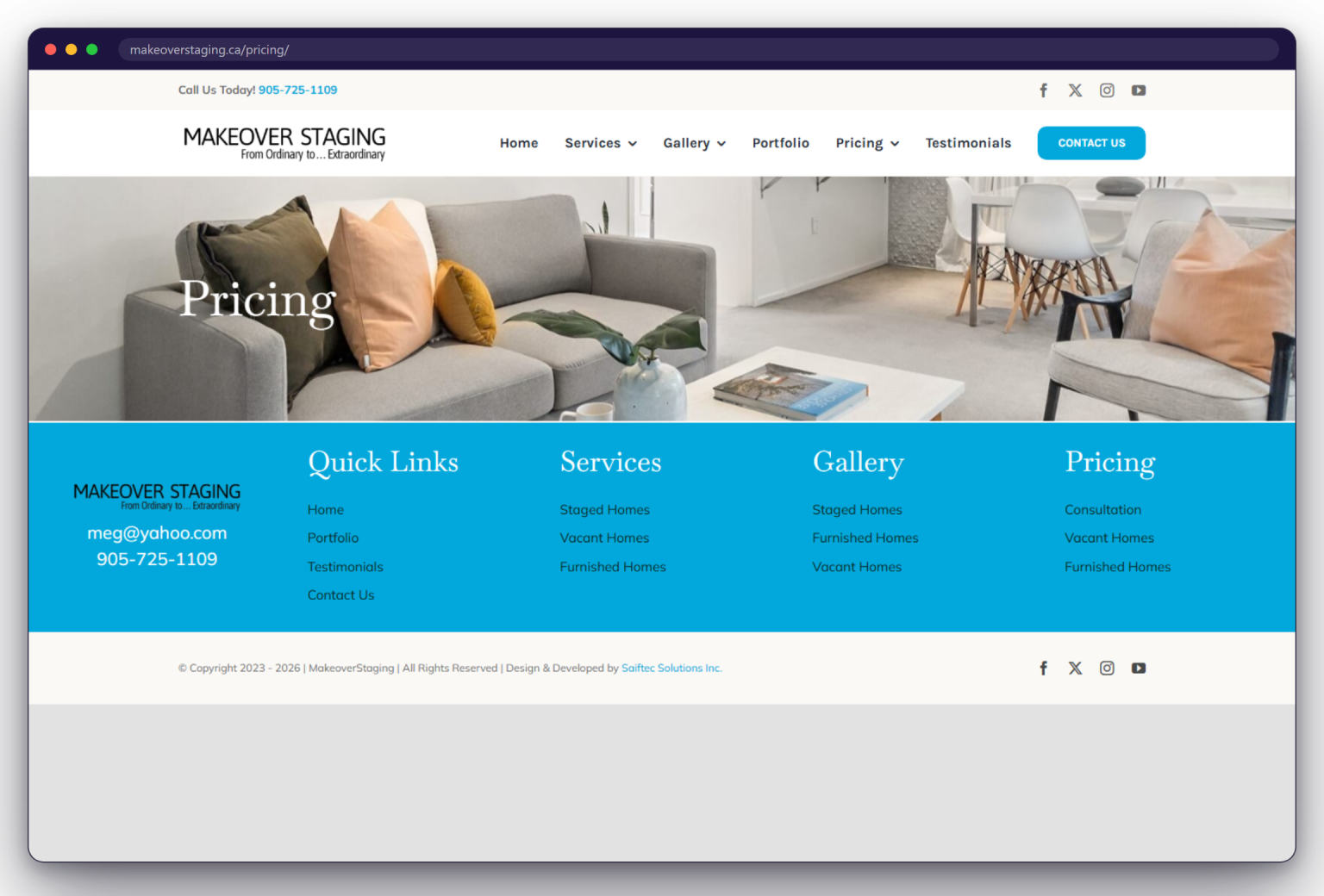








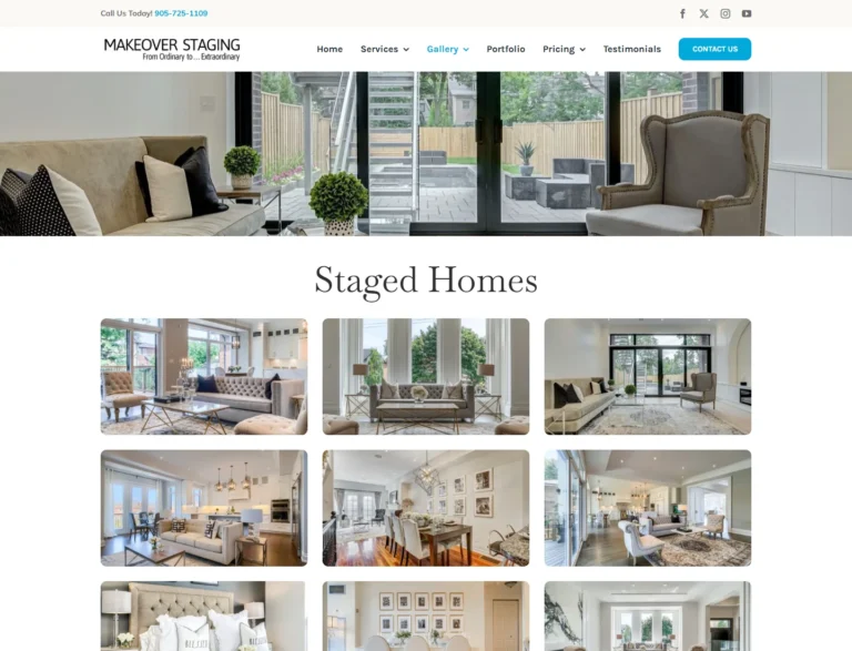
The public site separates home staging, vacant-home staging, and furnished-home staging into dedicated routes. Visitors can start with their property situation, then review the relevant service and pricing information before making contact.
The Challenge
Beautiful Work Had to Become a Clear Digital Decision Journey
Home staging is evaluated visually, but choosing a service also depends on property condition, available furnishings, scope, and budget. The rebuild therefore had to do more than display attractive rooms: it needed to help homeowners and real estate professionals identify the right service, understand what each option includes, review credible examples, and know what to do next.
- One audience, different property starting pointsConsultation, vacant-home staging, and furnished-home staging require different preparation, inventory, and expectations. The information architecture needed to keep those paths distinct without making the experience feel fragmented.
- Pricing needed context, not false precisionThe public site presents estimates that vary by service and property size. Those ranges needed to remain useful while making their conditions and exclusions visible.
- The work had to be shown, not merely describedRoom photography, project galleries, and property examples carry more decision-making weight than generic claims for a visual service.
- Homeowners and agents arrive with different questionsVisitors may be comparing service scope, preparing a listing, reviewing past work, or trying to establish an initial budget. The site needed several clear entry points into one coherent journey.
- The next step had to remain obviousAfter visitors review services, pricing, portfolio work, or testimonials, direct phone and email routes needed to be easy to find without relying on an unverified form workflow.


