


 First Website Build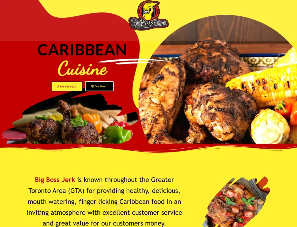


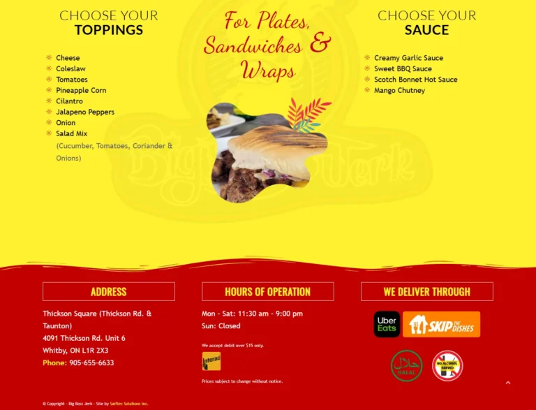
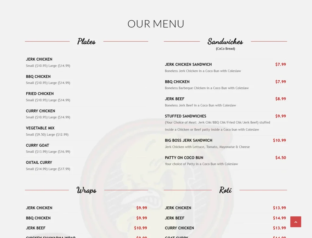
 Toppings and sauces guide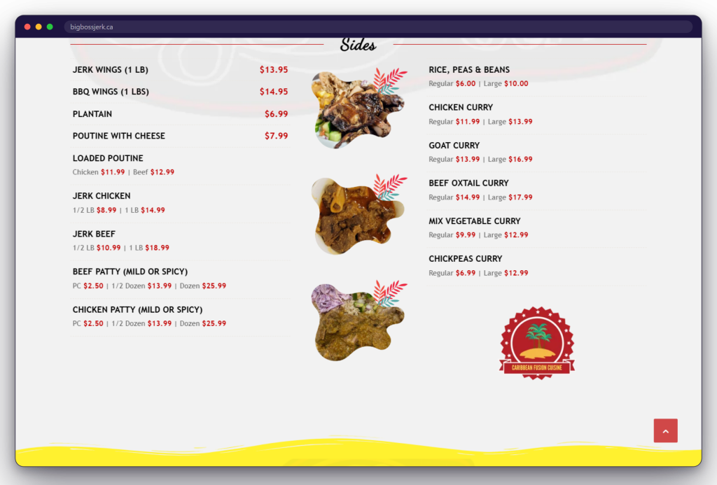
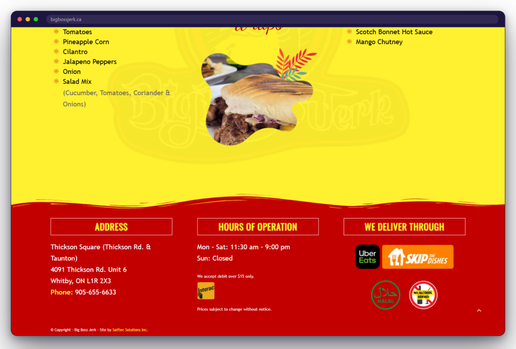
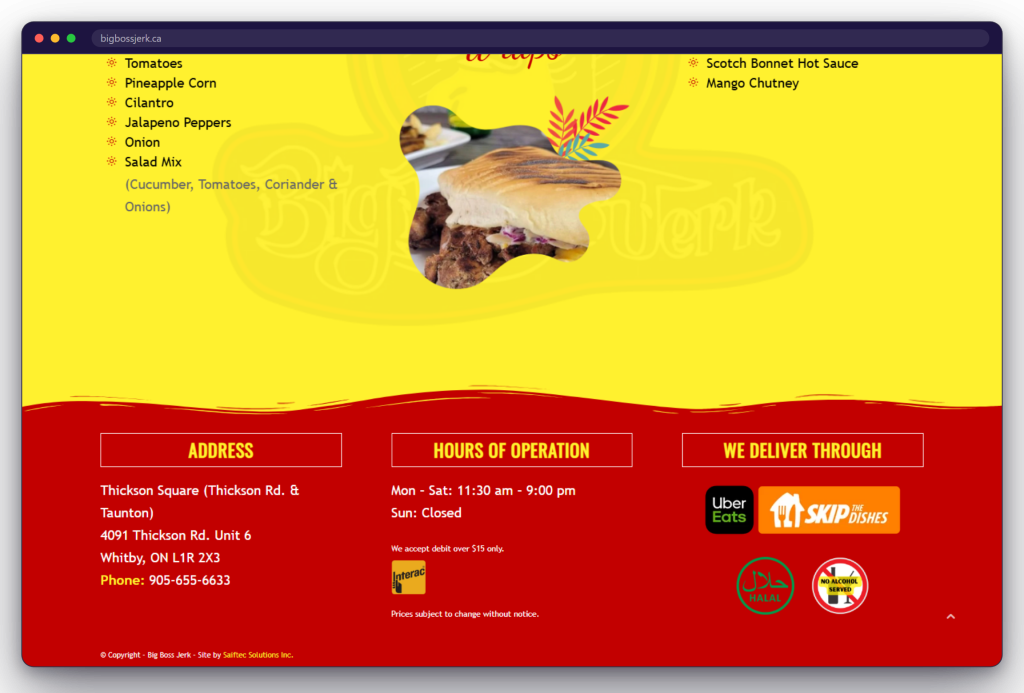
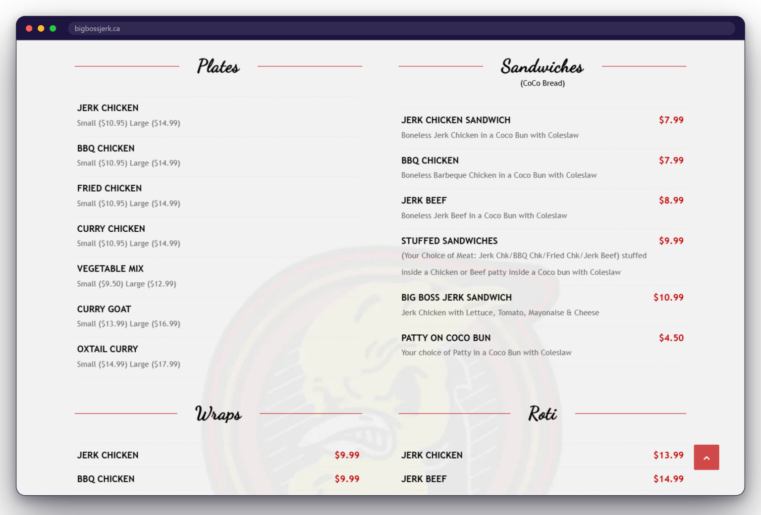







For Big Boss Jerk, the one-page structure keeps the cuisine introduction, menu, customization choices, and restaurant details in one continuous experience. It suits a focused public site without implying that every restaurant project should use the same architecture.
The Challenge
An Extensive Menu Had to Stay Fast to Understand
Big Boss Jerk's first website needed to introduce the restaurant and present a sizeable menu without making hungry, often mobile visitors work through multiple pages. The experience also had to preserve important differences between formats, sizes, prices, toppings, and sauces while keeping the practical details for calling or visiting easy to find.
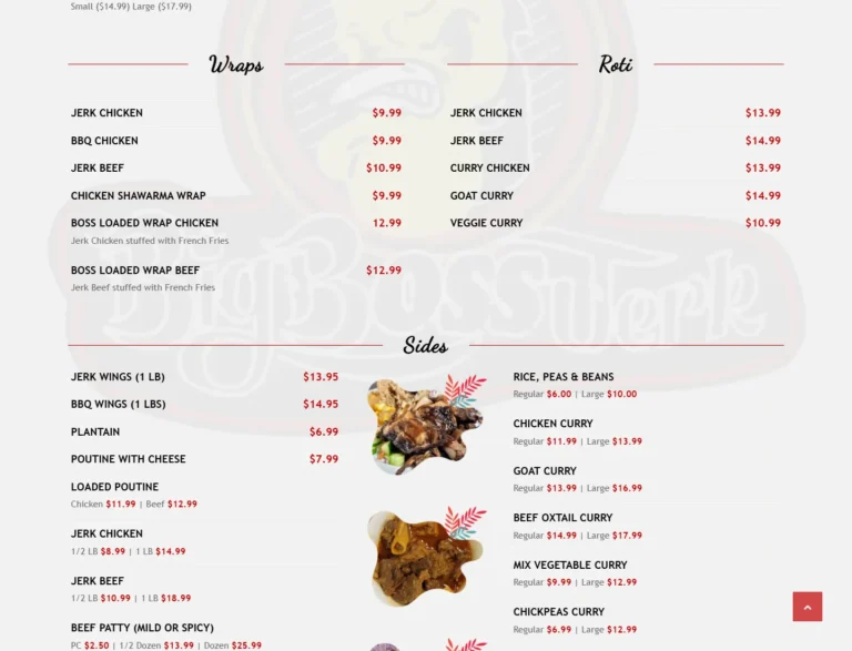
- Five menu families could become one overwhelming listPlates, sandwiches, wraps, roti, and sides needed clear visual separation so visitors could begin with the kind of meal they wanted.
- Prices and serving options vary by itemSmall and large plates, single items, weight-based portions, and quantity options had to stay attached to the correct menu choice.
- Customization requires its own sequenceToppings and sauces apply to selected meal formats and needed a dedicated, scannable area rather than being buried in individual descriptions.
- Restaurant essentials had to live in one dependable placeAddress, opening hours, telephone number, payment note, delivery-service branding, and food-service indicators all needed a clear destination.
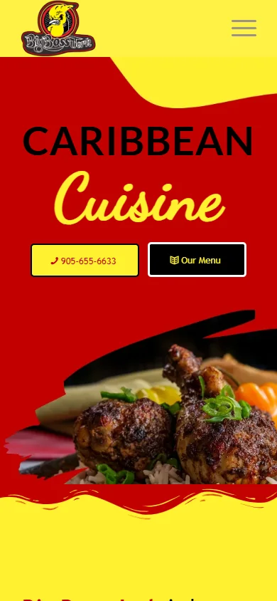
- The experience had to remain usable on a phoneThe navigation, large food imagery, menu content, and call action needed to adapt to a narrow screen without changing the information hierarchy.


